
Self Portrait, c. 1978, unique screenprint
Andy Warhol was one of the leading pioneers of Pop Art, if not the best-known Pop artist, whose distinctive style is immediately recognisable and whose prolific collection of works have become some of the most familiar examples of Pop Art. Born in Pittsburgh, he studied pictorial design at the Carnegie Institute of Technology before moving to New York in 1949.
Warhol’s photographic screenprinting technique evolved gradually from his early training as a graphic designer and illustrator to his successful career as a commercial artist in the 1950s but it was not until the early 1960s that Warhol began to develop a new technique more suited to the machine age of mass production. In 1962 Warhol first started to develop photographic screenprinting, which enabled him to combine images from popular culture with the printing processes of the modern commercial world as well as to reproduce identical images very quickly with uniformity. In his autobiography Warhol later explained his transition to this new technique;
“The rubber stamp method I’d been using to repeat images suddenly seemed too homemade; I wanted something stronger that gave more of an assembly-line effect. With silk-screening, you pick a photograph, blow it up, transfer it in glue onto silk and then roll ink across it so the ink goes through the silk but not through the glue. That way you get the same image, slightly different each time. It was all so simple- quick and chancy. I was thrilled with it.”

Marilyn, 1972, screenprint in colours
One of Warhol’s most iconic works and one of his first screenprints was his Marilyn Monroe series, which was produced within a matter of weeks after Monroe’s suicide on 5th August 1962. The image is based on a cropped black and white original publicity photograph taken when Marilyn was at the height of her fame, when she was seen to epitomise American beauty and glamour. In his large print series such as Marilyn or Chariman Mao, although the image remains the same for each, Warhol shifts the use of colours from print to print and uses anti naturalistic day glow colours such as orange, purple and green for the hair, facial features or skin, with each print comprised of four of five contrasting hues.

Mao, 1972, screenprint in colours
Warhol’s artistic production was centred on his studio in Midtown New York, named ‘The Factory’ and opened in 1963 – the name alluding to the technological age of post war industry like the effect he strove to mimic. Warhol produced his recognisable screen-print series Flowers in 1964 and 1965 working on both 24 and 48 square canvases each finished in vibrant contrasting colours with varied compositions, intended for a show with Leo Castelli, his dealer, in New York that year. Unlike Marilyn or Campbell’s Soup, Flowers was different in leaning towards the more abstract- rather than concerned with consumerism or celebrity culture.
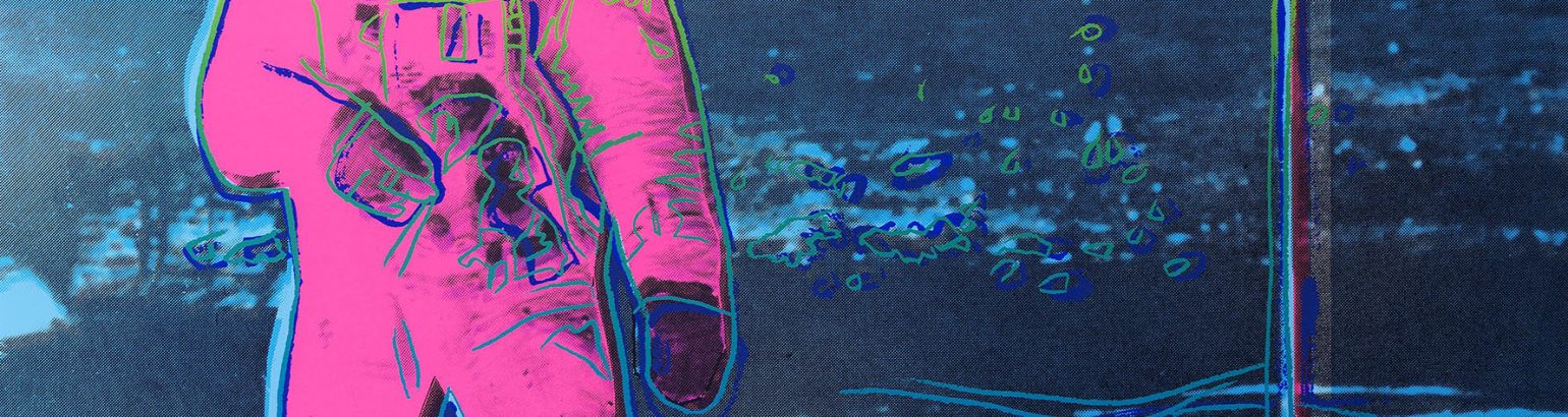
Sims Reed Gallery has dealt with many of Warhol’s most celebrated prints including his Mao, Campbell’s Soup, Marilyn, Moonwalk, Liz, Flowers, Mick Jagger and 25 Cats Named Sam and One Blue Pussy series.
In 2020, the Tate Modern, London, will be holding an retrospective of Warhol’s work.